
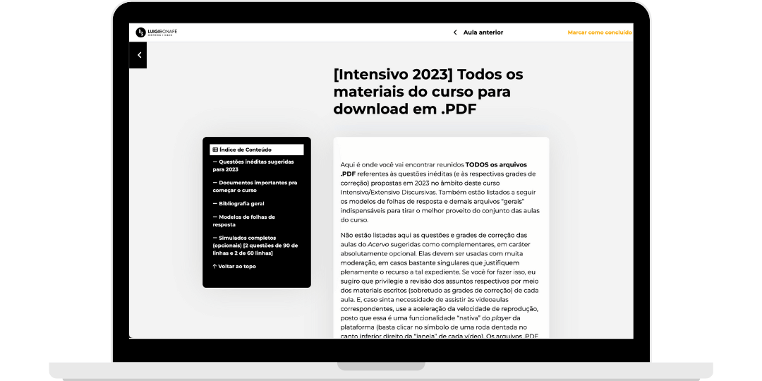
Organizing content: the lesson index
Luigi Bonafé is a History teacher who built his own education platform to teach aspiring diplomats preparing for the Diplomatic Career Admission Exam (CACD), the public exam for entering the diplomatic career in Brazil.
Problem:
With many demands on the table, one of the first things we solved was how lessons were organized. Unlike many of my clients, whose lessons are shorter and easy to break up, the History lessons for aspiring diplomats were long, with many embedded resources, videos and references. Our task was to organize the content better for students so they would not miss anything.
Solution:
We went through several design iterations, and the one chosen was a floating table of contents that organizes the content automatically, along with improvements to the lesson design.
Technology used:
- Everything was custom-coded
Step one: proposed solutions.
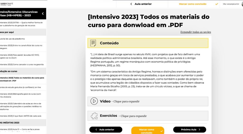 Proposal 1: accordions that expand and collapse the content.
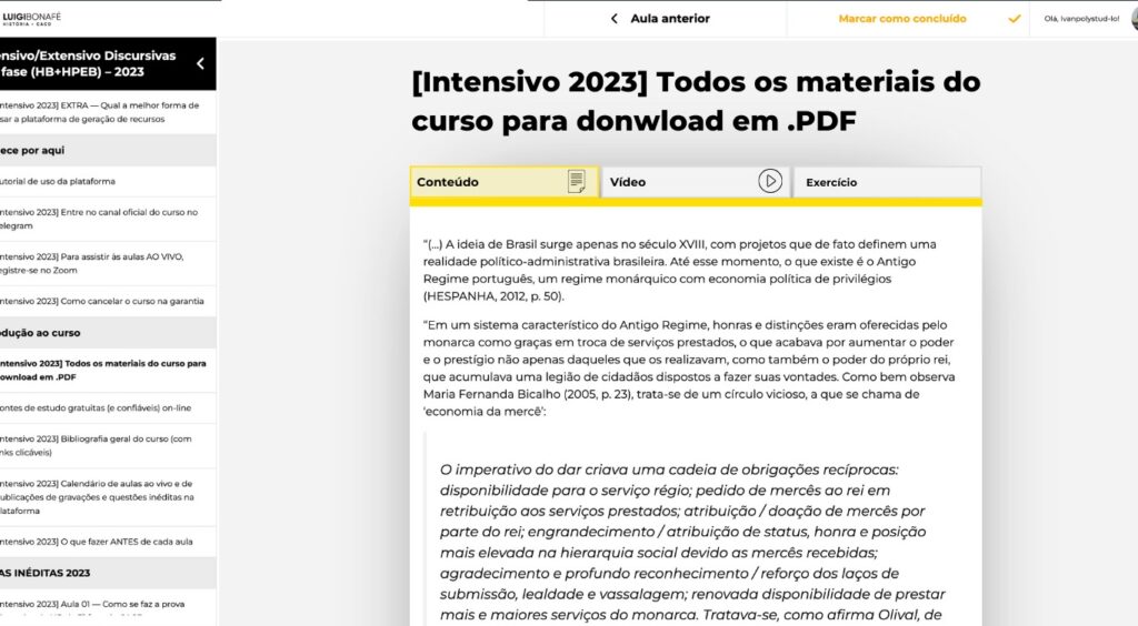 Proposal 2: content separated into tabs.
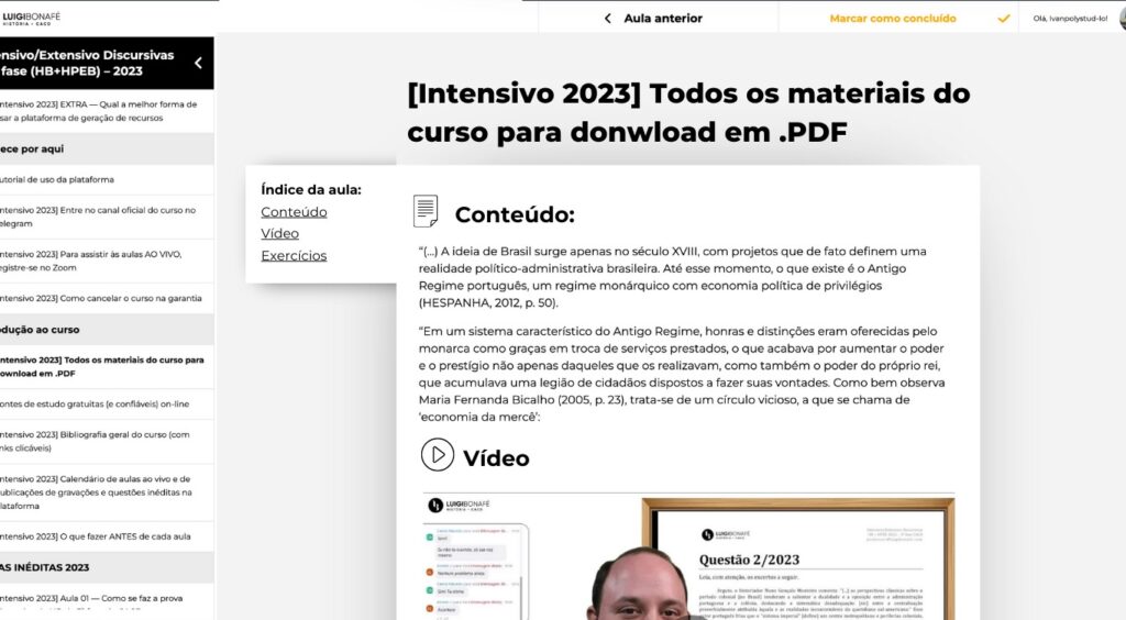 Proposal 3 (chosen): floating index.
We approached the challenge with a series of proposals, each with pros and cons that we presented to the client. Every proposal solved the problem, and the client also contributed their view of the brand and their knowledge of how their audience would react. The solution we chose was a floating table of contents.
The advantages of the chosen solution.
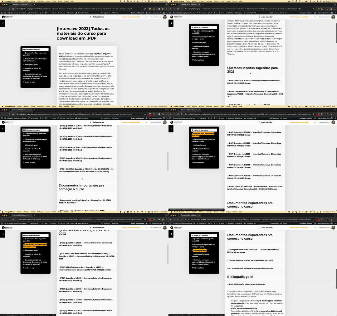 One advantage of this proposal is that it requires no extra effort on the content side. We wrote JavaScript that detects the lesson's subheadings (h2, h3, h4...) and adds them automatically to a window placed to the left of the lessons.
The accordion option had a drawback: a student could collapse a section without noticing and lose sight of it. We could prevent that by making it obvious that it was a button, but since accordions are an unusual pattern in education, we decided against it.
The tabs option, while elegant, would require the administrator to categorize every content section of every course by hand.
Here is the mobile version of the solution.

How we built the solution.
We wrote JavaScript that detects the headings and adds them to a window, organized hierarchically by heading level (h3 headings nested under h2 headings). By default, the window floats to the left of the content and follows the scroll. On mobile, the index stays fixed at the top to save space.
We also changed a few design details: the lesson side panel is collapsed by default to give the content more room; we added a gray background so reading is less tiring, since there is a lot of text; we separated the lesson sections more clearly so students can tell when one piece of content ends and the next begins; and we removed unnecessary navigation elements so students can focus.
Here is the before and after.
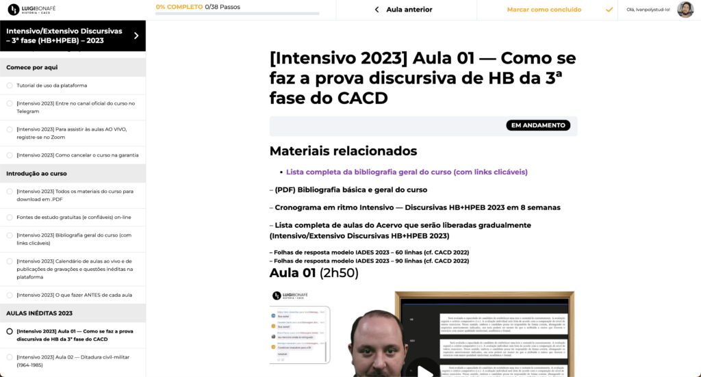 Before
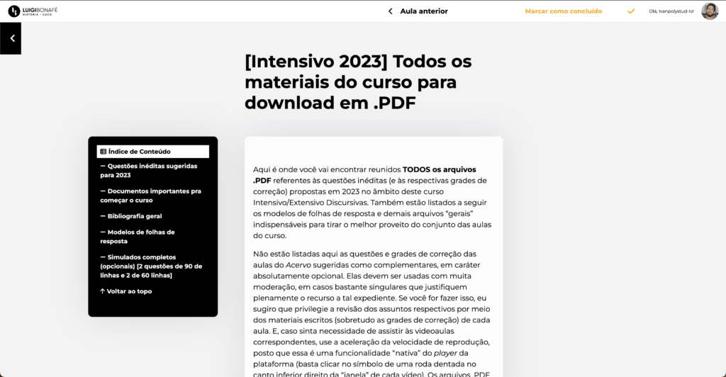 After